Jekyll2026-05-16T18:00:17+00:00https://bd-econ.com/feed.xmlBD EconomicsDemo: side-by-side figure2026-05-16T13:00:00+00:002026-05-16T13:00:00+00:00https://bd-econ.com/blog/2026/05/16/demo-side-by-side-figureThis is a demo post to show layout patterns available in blog posts. The body
is plain markdown but you can drop in <div class="post-split"> for a
side-by-side image + text layout that breaks out of the prose column into the
right margin.
Standard inline figure (centered)
A normal figure is centered inside the 600px prose column with an italic
caption beneath.
Source: CPS microdata, March 2026 — the standard inline figure presentation.
The text continues normally below.
Side-by-side (image right, text left)
Wrap a paragraph plus a figure in <div class="post-split"> to put them
side by side. The image gets pushed into the right margin, the text stays
left at prose width. On mobile this stacks vertically.
When wages adjust to match prices, both paychecks rise in a two-earner household. In a one-earner household with four dependents, only one paycheck rises, and that paycheck still has to feed five mouths. Each person in the household has consumption needs whose prices have risen.
The chart spills into the margin.
Side-by-side (image left, text right)
Same pattern, with .post-split--reverse flips the columns.
Image on the left.
The text sits to the right of the image. Useful when you want the chart to set the visual hook and the explanation flows from it. Both layouts collapse to a single column on small screens so mobile readers see image-then-text in natural order.
Pull quote
A blockquote in the body becomes a pull quote: larger italic, accent left
border, set off from the surrounding flow.
End of demo.
]]>Why Fewer People Are Out of the Workforce for Family2026-05-06T03:10:19+00:002026-05-06T03:10:19+00:00https://bd-econ.com/blog/2026/05/06/why-fewer-people-are-out-of-the-workforce-for-familyConsider household composition
As prices rise again, the question is which households suffer.
One standard answer points to low-income households. A larger share of their income goes to essentials, so price increases hit them harder. This is true, but it is a partial explanation. Households also differ in how many household members work for pay and how many depend on them, and the ratio between these groups matters even when wages outpace inflation.
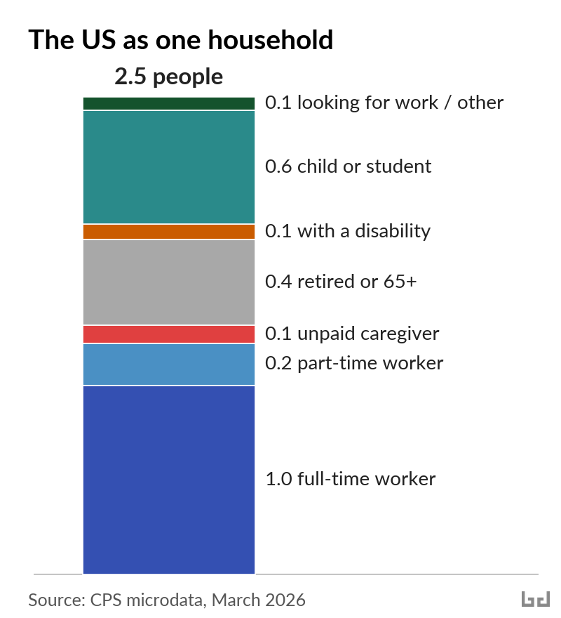
When scaled to a single 2.5-person household, the US population looks like this: about one full-time worker, two-tenths of a part-time worker, and the rest a mix of children or students, retirees, unpaid caregivers, people with disabilities, and people looking for work (see chart 1). Those are population averages. No household actually contains 0.6 of a child or 0.4 of a retiree.
Real households contain whole people. Some households consist of two earners and no children. Some have one earner with a spouse and three children. Some are two retirees on a fixed pension. Some are a single parent with two children and one elderly grandparent.
When wages adjust to match prices, both paychecks rise in a two-earner household. In a one-earner household with four dependents, only one paycheck rises, and that paycheck still has to feed five mouths. Each person in the household has consumption needs whose prices have risen. The more people per earner, the more total inflation pressure the household carries. Let’s look at how families respond to that pressure.
Changes in participation: three illustrative groups
Since 2022, fewer women in the US have been out of the workforce for family or caregiving reasons. The count fell from 12.3 million in March 2022 to 11.3 million in March 2026. That move is part of a broader rise: when adjusted for age, women are participating in the labor force more now than at any point in the past.
While progress on women entering the labor force largely stalled from 2000 to 2015, it has recently accelerated. The long arc points to higher workforce participation. About 70% of middle-class kids grew up with a stay-at-home mom in 1960; the share has fallen to about 20% in 2024.
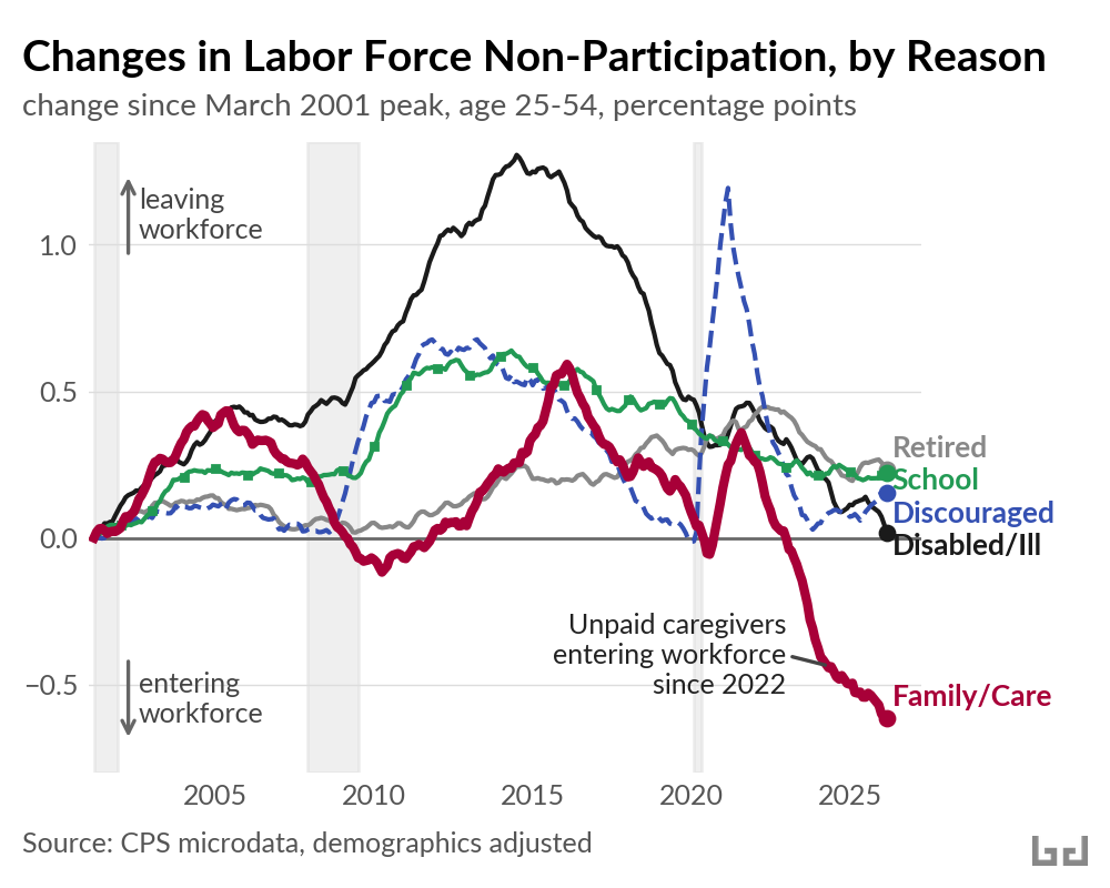
Among adults age 25 to 54, the main reasons for labor force non-participation are as follows: family or caregiving, disability or illness, school, early retirement, or no longer looking for work. In March 2001, US labor force participation was near its all-time high, and since then the reasons for increased non-participation have varied (see chart 2). By 2022, the share out of the workforce for family or caregiving reasons was back at the same level as in 2001. But the share has fallen sharply since.
Within this shift in labor force participation, three illustrative groups of women responded differently, depending on the daily care needed at home.
1. Women without children at home
Slightly more than half of the move out of family roles came from married women without children at home. The share of the group staying home for family fell from 5.0% to 4.4% between 2022 and 2026.
When there are no children at home, time previously kept for unpaid family work can go to paid work without the need to buy daycare. Following the pandemic era spike in cost of living, hundreds of thousands of women in this group entered the labor force.
2. Mothers of one-year-olds
Mothers of one-year-olds did not follow the same pattern. Their share staying home for family was 30% in both 2019 and 2026, even as workforce participation among other groups of women rose.
An infant requires care during most of the waking day. The US doesn’t fund public daycare for infants at any meaningful scale. Federal pandemic-era funding that had helped some low-income families afford private infant care expired in September 2023.
For households where one parent stays home with an infant, a second wage often wouldn’t cover replacement childcare. Center-based infant care can cost as much as a parent’s paycheck. When prices rose between 2022 and 2024, that calculation did not change in favor of paid work.
3. Mothers of three- and four-year-olds
Mothers of three- and four-year-olds did move into paid work. Their share staying home for family fell from 24.5% to 22.7% between 2022 and 2026. Their employment rate rose by nearly two percentage points.
By age 3 or 4, kids need less hands-on care than infants. Public pre-K can cover much of what’s still needed. Twelve states fund universal or near-universal pre-K for four-year-olds, with several hours of supervised care per weekday.
In states with public pre-K, mothers of three- and four-year-olds moved into paid work between 2022 and 2026. Where public childcare reaches, paid work and family work both fit into the day.
Who loses when prices rise
When prices rise, households with more dependents shoulder more of the increase. The 2022-2026 family-care decline is one slice of that pattern.
In households where the adults all work and there are no children, poverty stayed at 5.4% across the 2019-2024 period. In households with one dependent (a child or non-working adult under 65), the poverty rate climbed from 12% to 14%. With three or more dependents, poverty climbed from 18% to 20%, about one in five. Where someone wasn’t earning, poverty rose about two percentage points across the period.
Households have consolidated, too. As one example, the share of Americans aged 18 to 29 living with family was 48% before the pandemic; it crossed 50% in 2023 and reached 53% by March 2026. When the cost of forming a new household increases, more adult children stay home or move back in, a shift in living arrangements that spreads costs.
Other rich countries let fewer prices land entirely on households. They offer public services that absorb private costs (for example childcare and healthcare) and also provide direct cash transfers such as child allowances. Both tools achieve the same goal: fewer households where prices outpace income. The US uses neither of these tools at the same scale.
As prices rise again, the burden will land where it always does here, on the households where wages are stretched thinnest. Until something else is set up to absorb the burden of inflation, vulnerable households do.
]]>IMF forecasts 3.2% US inflation rate in 20262026-04-14T14:17:23+00:002026-04-14T14:17:23+00:00https://bd-econ.com/blog/2026/04/14/imf-forecasts-3-2-us-inflation-rate-in-2026The April 2026 IMF World Economic Outlook is out. Headline forecasts for 2026:
US inflation: 3.2%
US GDP growth: 2.3% (+0.2 vs. October 2025)
World GDP growth: 3.1% (unchanged vs. October 2025)
To make it easier to track how these forecasts evolve, I built the IMF WEO Tracker — a new tool that visualizes and compares WEO vintages going back to 1990, across 196 countries and key indicators. You can see where forecasts converged, where they missed, and how they were revised as new data arrived.
]]>Income growth is slowing. For low-paid workers, real wages are falling.2026-04-14T02:48:45+00:002026-04-14T02:48:45+00:00https://bd-econ.com/blog/2026/04/14/income-growth-is-slowing-for-low-paid-workers-real-wages-are-fallingMarch inflation jumped to 3.3% year over year, up from 2.4% in February. The main driver was gasoline as the Iran war pushed pump prices from $2.98 to $4.15 a gallon. Core inflation held at 2.6%, for now.
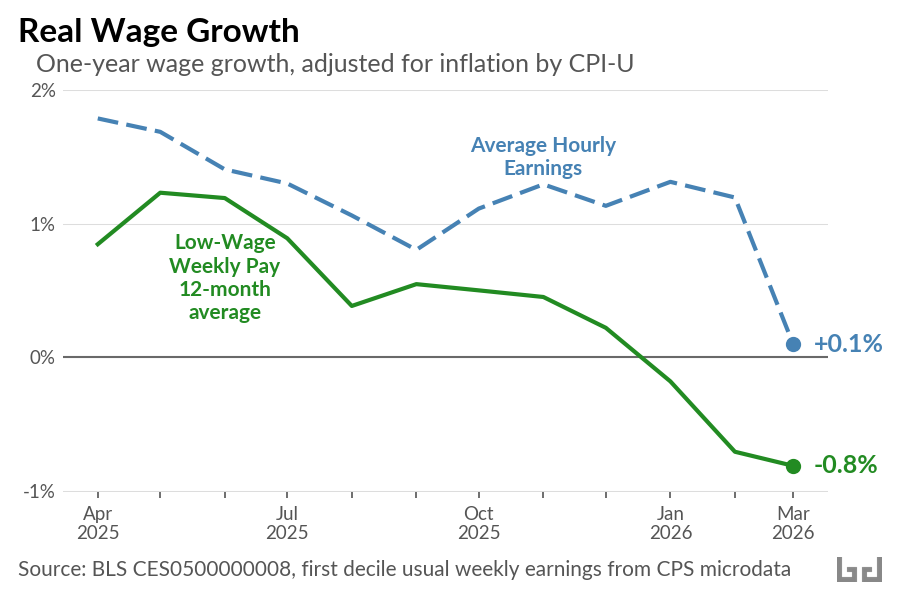
The price spike hit already-soft wage growth. Average hourly pay for production and non-supervisory workers rose 3.4% over the year ending March, down from 3.7% in January and February. Adjusted for inflation, real hourly pay grew 0.1% in March, after 1.2% in February. Workers at the bottom, where nominal growth has been slowing the longest, went negative. The 12-month average of real weekly pay at the first decile is down 0.8% over the past year.
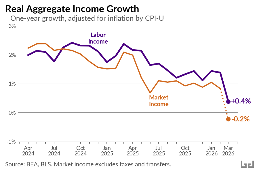
Aggregate income tells the same story. Gross labor income, total pay across the workforce, rose 3.7% nominal in March, down from 4.8% a year earlier. Deflated by the CPI, real labor income is growing 0.4%. Real market income, personal income excluding taxes and transfers, is flat, and likely turned slightly negative in March once the CPI spike is reflected.
Three forces are pushing this lower.
First, demographic. A new FEDS Note by Murray and Vidangos shows labor force growth slowing to near zero in 2026, the weakest in modern US history. With immigration collapsed and the population aging, the monthly payroll number needed to hold the employment rate steady has fallen below 10,000. Soft headline prints are partly structural, not just cyclical.
The cyclical side is real, too. Hiring has slowed sharply. JOLTS shows 4.8 million hires in February, down from a 2019 average of 5.8 million. Openings are 6.9 million and the quits rate is 1.9%, near a decade low outside the pandemic. When the labor market runs hot, workers have leverage. They switch jobs, negotiate, and pull wages up. That leverage has faded.
Prices are the third piece, and the March data is where all of this shows up. Before the war, tariffs were already pushing core goods inflation higher. The Iran war then pushed gasoline 39% higher, lifting March CPI to 3.3% year over year. The result is the single worst month for real hourly pay in roughly four years.
Looking forward, the OECD forecasts US inflation at 4.2% in 2026, the highest in the G7. If that path holds, the March flip in real market income will not be a one-month event.
And one cushion households had counted on is gone. Markets priced in a steady path of Fed rate cuts earlier this year, which would have eased mortgage and other borrowing costs. The federal funds target now sits at 3.5 to 3.75%, and those cuts have been pushed out indefinitely. That relief is off the table.
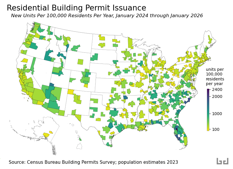
]]>Where is Housing Being Built? (2026 update)2026-04-13T05:27:34+00:002026-04-13T05:27:34+00:00https://bd-econ.com/blog/2026/04/13/where-is-housing-being-built-2026-updateWhere people move and where housing gets built tend to go together, and both are concentrated in the US south even as housing prices remain well above their pre-pandemic levels in most areas. Of the 1.8 million people added to the US from July 2024 to July 2025, 1.2 million were in the south, and most new housing supply has been added there as well.
As one result of these changes, California and states in the northeast region will continue to lose congressional seats, and states in the south will add them. In discussions of that apportionment shift, some have pointed out that most of the new housing is also being built there. It only follows that the south will have the population growth. Cause and effect here aren’t clear-cut, but this seems reasonable.
Each month the Census Bureau reports building permits issued in major metro areas. Using these reports, I’ve divided new housing units permitted in each metro area each year by the resident population. The goal is to identify where new housing is likely to grow fastest relative to population. The results are mapped below for the period from January 2024 through January 2026.
Not every permit ends up being built, but the map gives a decent idea of where growth is likely over the coming year. Since the last version of this post, the overall pace of permit issuance has slowed by roughly 10 percent, with nearly all of the decline concentrated in apartment buildings. Higher interest rates have made large apartment projects harder to finance.
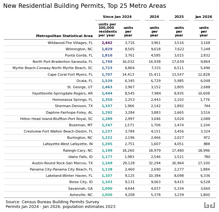
The following table shows the top 25 metros by units issued per resident per year. The highest rate is again in the smaller- and mid-sized metro areas of central and southwest Florida, where Wildwood–The Villages, a large retirement community, leads the nation at about 2,440 permits per 100,000 residents per year. The biggest shift from the 2023 version of this post is in Austin, Texas: after leading the large-metro ranks last time, Austin has slipped to 20th. Its early-2020s construction boom appears to have caught up with demand, and the pace of new permits has since eased. Raleigh, North Carolina is now the fastest-building large metro, fitting the pattern: where the south builds, the south grows.
]]>The Rhetoric of Austerity2026-04-08T17:28:06+00:002026-04-08T17:28:06+00:00https://bd-econ.com/blog/2026/04/08/the-rhetoric-of-austerityIn 1991, Albert Hirschman published The Rhetoric of Reaction, identifying three arguments that have been used to oppose social programs since the French Revolution. He called them the perversity thesis (the program hurts the people it claims to help), the futility thesis (the program accomplishes nothing), and the jeopardy thesis (the program threatens something we already have). All three are in circulation today, and can be understood as stages in a cycle.
Stage 1: Create the crisis
The cycle begins with a deliberate fiscal choice. Tax cuts reduce revenue. The resulting deficit becomes the justification for cutting programs that had nothing to do with the shortfall.
This is not a secret. Reagan’s budget director David Stockman told Senator Daniel Patrick Moynihan that “the plan was to have a strategic deficit that would give you an argument for cutting back the programs that weren’t desired.” One of Reagan’s advisers explained to Friedrich Hayek that the president permitted large deficits because they made “absolutely everyone convinced that no more money can be spent.” Grover Norquist put it more plainly: the goal was to shrink government “down to the size where we can drown it in the bathtub.”
The reconciliation bill signed in July 2025 increases the federal deficit by $3 trillion. It also cuts over $1 trillion from Medicaid and SNAP.
Stage 2: Cite the crisis (jeopardy)
With the deficit in place, the jeopardy thesis follows. Programs that were affordable before the tax cut are now portrayed as threats to fiscal stability.
Hayek warned in 1944 that the welfare state would lead to totalitarianism, though he also endorsed a minimum of food, shelter, and clothing for all. Reagan declared in 1981 that “government is not the solution to our problem; government is the problem.” At an Easter lunch in April 2026, President Trump said: “We’re fighting wars. We can’t take care of day care.” The video was posted to and then removed from the White House website. During his 2024 campaign, Trump had promised that tariff revenue would easily cover childcare.
The FY2027 budget requests $1.5 trillion for defense, a 44 percent increase, while cutting domestic programs by 10 percent. Medicaid is put on “a more sustainable path.”
Stage 3: Defund, then declare failure (futility)
Programs that survive the jeopardy stage are starved of operational capacity. Administrative capacity is cut. Eligibility rules are made more complex. The resulting dysfunction is then cited as evidence that the programs were never effective.
Stuart Butler of the Heritage Foundation described the strategy in the 1980s: build a “parallel system” of private accounts that would gradually create a constituency for dismantling public programs. “You wean people gradually off of social-insurance risk management into private risk management.” The FY2027 budget follows this template. Research grants are replaced by “competitive awards.” The Rural Business Service is eliminated because the Small Business Administration “already” serves rural areas. LIHEAP, which provides heating and cooling assistance to low-income families, is cut on the premise that increased private energy production will make the program unnecessary.
The SNAP cuts in last year’s reconciliation bill illustrate manufactured futility. The bill cuts federal administrative funding in half, expands complex work requirements that increase eligibility errors, and then penalizes states based on their error rates. Arizona has already lost 47 percent of its SNAP participants, including 180,000 children, since the bill took effect.
Stage 4: Frame the cuts as compassion (perversity)
At the final stage, the cuts are reframed as kindness. Removing people from programs is described as freeing them from dependency.
This is the oldest argument in the cycle. The 1834 New Poor Law in England cut food rations in workhouses and separated families, on the theory that generosity created poverty. Charles Murray recycled the same claim in 1984: “We tried to provide more for the poor and produced more poor instead.” Hirschman noted that except for a slight toning down, the melody was the same, 150 years later.
The perversity thesis has never been limited to one party. Bill Clinton signed the Personal Responsibility and Work Opportunity Act in 1996 to “break the cycle of dependency.” In 2021, Senator Joe Manchin told colleagues that parents would use the expanded Child Tax Credit to buy drugs. The credit, which had cut child poverty to its lowest rate on record, expired. In the current budget, SNAP work requirements are framed as “returned accountability.”
Hirschman observed that people do not gouge out their eyes to qualify for disability benefits. When industrial accident insurance was introduced in Europe, employers claimed workers were mutilating themselves on purpose. The reports were found to be highly exaggerated.
The contradiction
The three arguments require three different versions of reality. Perversity assumes a world so responsive that every policy triggers a backlash. Futility assumes a world so rigid that policy bounces off. Jeopardy assumes the policy is effective enough to be dangerous.
These are opposite claims about how the world works, used to justify the same action: cutting programs. Hirschman observed that this logical incompatibility does not stop people from deploying both arguments against the same policy, sometimes in the same debate.
The arguments are chosen for what they justify, not for whether they are true.
Estimates of last year’s reconciliation bill’s Medicaid and SNAP cuts project a $154 billion reduction in state GDPs, 18 percent more than the $131 billion in federal savings they generate. Households in the bottom 10 percent lose an average of $1,600. Households in the top 10 percent gain $12,000. The arguments rotate. The direction of the transfer stays the same.
The FY2027 budget proposal follows the same pattern. It runs a $2.2 trillion deficit while framing $73 billion in domestic cuts as fiscal necessity. The cuts amount to about 3 percent of the deficit they sit inside.
The next time someone tells you a program costs too much, accomplishes nothing, and hurts the people it serves, all at once, the pattern is worth recognizing. Hirschman’s framework makes it easier to see, and harder to take seriously.
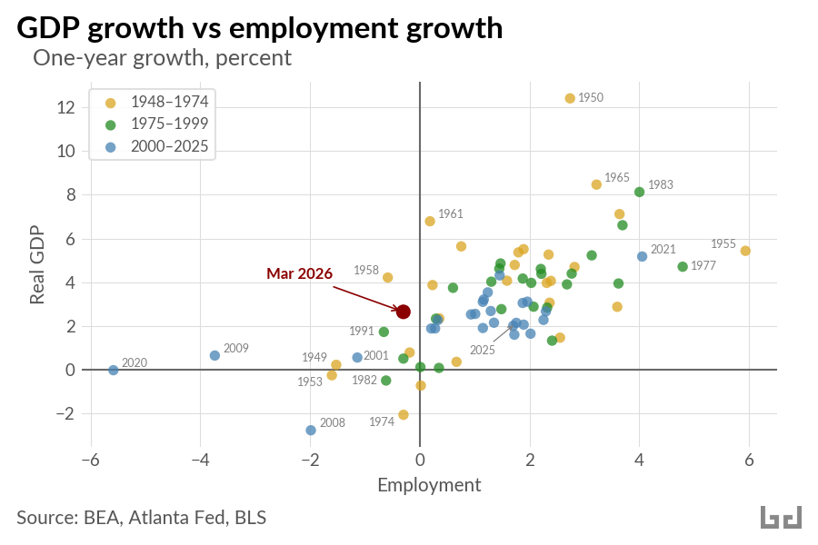
]]>Employment Is Falling. Is GDP Next?2026-04-08T00:05:44+00:002026-04-08T00:05:44+00:00https://bd-econ.com/blog/2026/04/08/employment-is-falling-is-gdp-nextGDP growth and employment growth usually move together. The scatter below plots one-year changes in each, from 1949 to 2025, plus March 2026 in red. The correlation is 0.70.
March 2026 sits in an unusual position: GDP has grown over the past year while employment fell 0.3 percent. That combination shows up a few other times in the data (1958, 1991, 2001, 2009) but in each case the economy was recovering from a recession. There is no recession to recover from in 2026.
A recent FEDS Note by Seth Murray and Ivan Vidangos traces the mechanism. An aging population combined with collapsing net immigration has pushed labor force growth to near zero. The breakeven pace of employment growth has fallen below 10,000 per month, far below any point in the past 65 years. Additionally, federal civilian employment is down 11 percent year-over-year, the steepest peacetime decline on record.
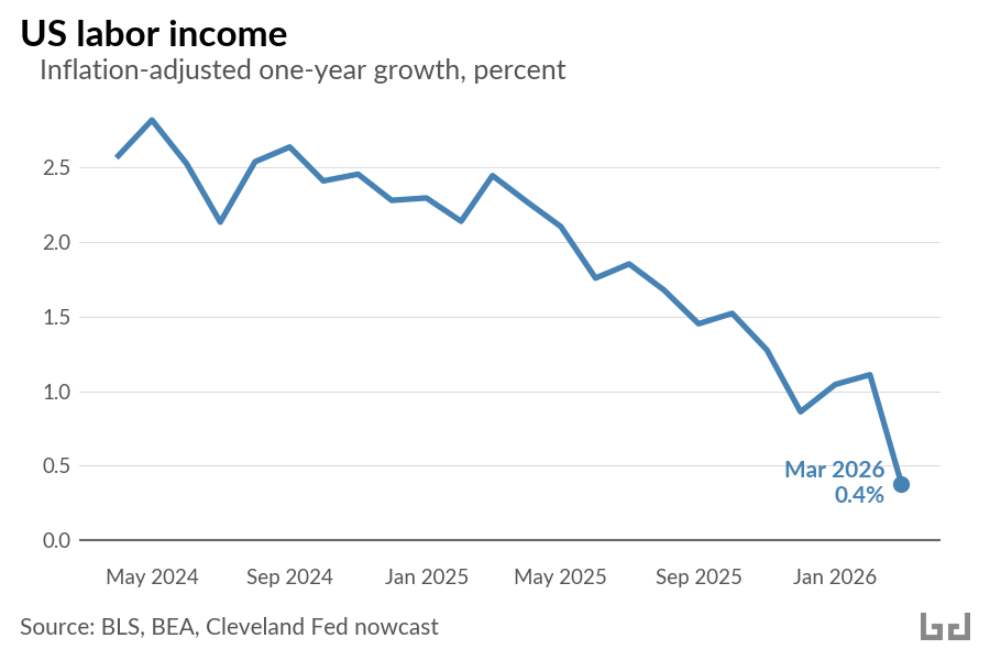
The income side of the economy reflects the job market slowdown. In a healthy economy, US labor income should grow by five percent or more per year. This includes higher wages tied to productivity, cost of living adjustments tied to inflation, and new wages paid to new workers as the workforce grows. Over the past year, amidst a shrinking workforce, nominal gross labor income grew only 3.7 percent. Critically, inflation is now heading toward 3 to 4 percent. The difference between the two measures, real labor income growth, is approaching zero.
GDP growth is decelerating too. After strong quarters in mid-2025 (3.8 and 4.4 percent annualized), Q4 came in at 0.7 percent and the Atlanta Fed Q1 nowcast sits at 1.3 percent. Over the past two quarters, annualized growth averages 1 percent. Coincidentally, Josh Bivens at EPI estimates that about 1 percentage point of recent GDP growth comes from AI-related channels (a stock market wealth effect and capital expenditure) that he characterizes as fragile.
The labor side of the growth equation is stalling. Productivity has to carry everything. That is a lot to ask.
]]>China is exporting cheap capital goods to the world2026-04-06T02:41:59+00:002026-04-06T02:41:59+00:00https://bd-econ.com/blog/2026/04/06/china-is-exporting-cheap-capital-goods-to-the-world
In 1950, the Argentine economist Raul Prebisch published a finding that would shape development economics for decades: the prices of commodities exported by poor countries were falling relative to the manufactured goods they imported from rich ones. The structure of global trade, he argued, transferred the productivity gains of the periphery to the center. Poor countries grew the coffee; rich countries sold the tractors.
Seventy-five years later, something has inverted. China was itself part of Prebisch’s periphery within living memory. Today it is the world’s largest exporter of manufactured goods. And what it exports is solar panels at eight cents per watt, electric vehicles that outsell combustion engines, container ships, and steel. The capital goods that countries need to generate electricity, move goods, and build infrastructure.
The trade data tells this story. The trade data also understates the scale, because trade is measured in dollars, and when prices fall, each dollar carries more physical goods than it used to.
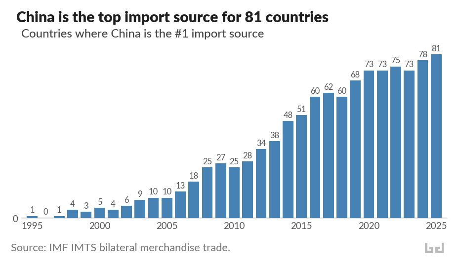
China is the top import source for 81 countries
World merchandise trade as a share of global GDP has stagnated since the 2008 financial crisis. Within that plateau, China’s position has transformed.
China is the top import source for 81 countries. The United States is the top source for 29. Germany for 18.
In 1995, China held this position for one country. By 2005, ten. By 2015, fifty-one. China is in the top three import sources for 164 of 207 countries. Only three have China outside their top ten: the Falkland Islands, Gibraltar, and Mauritius.
The countries making this switch span every income level. China is the top source for South Korea, Japan, Australia, and Norway. It is also the top source for most of the world’s lowest-income countries. The median country now sources about 15 percent of its imports from China.
And the pattern of displacement is consistent: countries are switching away from former colonial and hegemonic trade partners. France lost most of francophone West Africa. The United States lost much of Latin America and the Gulf. Japan lost most of East Asia. Russia lost Central Asia. The United Kingdom lost several Commonwealth nations.
What these countries are buying, increasingly, is capital goods.
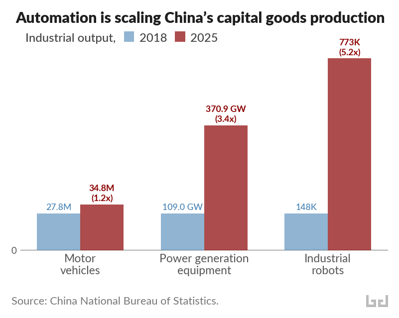
Automation is driving a surge in capital goods production
The conventional image of Chinese exports, cheap consumer goods and textiles, is twenty years out of date. Apparel fell from 8.7 percent of China’s exports in 2005 to 3.9 percent in 2025. What grew was electrical machinery, vehicles, ships, and steel.
The scale of this shift becomes clearer when measured in physical output rather than dollar values. Chinese factories produced 370.9 gigawatts of power generation equipment in 2025, 3.4 times the 2018 level. Motor vehicle production reached 34.8 million units, up from 27.8 million. And output of industrial robots hit 773,000 sets, 5.2 times the 2018 figure. China now installs more industrial robots annually than the rest of the world combined.
These categories reinforce each other. Robots automate the factories that produce vehicles and power equipment. Power equipment runs the factories that produce the robots. The result is a manufacturing system that scales up output while pushing unit costs down, a virtuous cycle that resembles what the Gutenberg press did for books: transforming expensive, labor-intensive goods into mass-market commodities.
Falling prices deliver an eightfold increase in solar exports
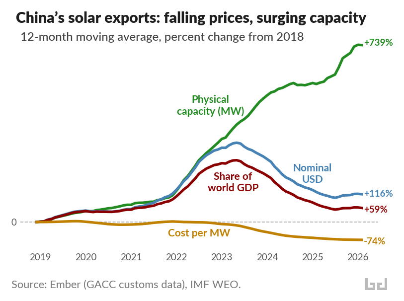
When the price of an exported good falls dramatically, each dollar buys more. For the countries importing Chinese capital goods, falling prices amount to a transfer of value from Chinese producers to foreign buyers. Solar panels are a striking example. Using data from Ember, which tracks Chinese customs records on solar exports by destination, we can measure the same trade flow in megawatts of generating capacity, in nominal dollars, and as a share of world GDP.
Since 2018, the physical capacity of Chinese solar exports has increased by more than 700 percent. In nominal dollar terms, exports only doubled. And as a share of world GDP, Chinese solar exports grew by just 59 percent.
The gap between physical and dollar growth reflects a price collapse: the cost per megawatt of exported solar capacity fell about 75 percent. A megawatt of Chinese solar panels that cost $261,000 in 2018 costs roughly $67,000 today.
This price collapse is transforming energy access in the developing world. In Africa, solar panel imports from China surged 60 percent in the twelve months through mid-2025, reaching 15 gigawatts. Sierra Leone alone imported solar capacity equivalent to 61 percent of its 2023 electricity generation. In Pakistan, Chinese panels at eight cents per watt are cheaper than the grid, and the country has avoided an estimated $12 billion in fossil fuel imports since 2021 by deploying rooftop solar. In Cuba, imports of Chinese solar panels grew 34-fold between April 2024 and April 2025, taking the island from zero to roughly 10 percent of electricity generation from solar in about a year. In Lebanon, cheap Chinese solar technology replaced the diesel generator networks that had powered the country for years.
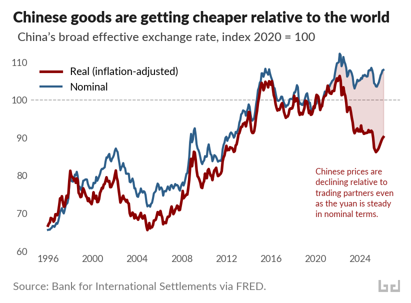
And the price gap is widening beyond solar panels. China’s real effective exchange rate measures, in a single number, how expensive Chinese goods are relative to those of its trading partners, adjusted for inflation. It has fallen 15 percent since early 2022, reaching its weakest level since 2012.
The chart above shows why this matters. The blue line is the nominal exchange rate of the yuan, trade-weighted against China’s partners. It has been roughly stable since 2020. The red line adjusts for relative price levels: it falls when Chinese goods get cheaper relative to the rest of the world. The shaded gap between them has been widening since 2020, driven by diverging price trends. Producer prices in Europe rose 35 percent over the past five years, and 26 percent in the United States. Chinese producer prices over the same period were flat or falling. The same nominal exchange rate now buys considerably more Chinese output than it did five years ago.
The decline is surprising. In standard economic theory, a country with rapid manufacturing productivity growth should see the red line rise. Productivity gains flow to workers as higher wages, higher wages push up domestic prices, and the real exchange rate appreciates. The same pattern held during the industrialization of Japan and Germany. Economists who studied an earlier episode of the same pattern in China called it “China’s real exchange rate puzzle,” and traced it to total factor productivity growth.
The robot data offers a more specific explanation. When productivity gains are embodied in labor, as in postwar Japan, wages rise and domestic prices follow. When productivity gains are embodied in capital, as in factories deploying industrial robots at unprecedented scale, wages face less upward pressure. The cost savings flow into lower goods prices instead. The widening gap between the two lines is the productivity revolution, made visible in prices.
The terms of trade for capital goods are moving in favor of the buyers
Raul Prebisch observed that manufacturing productivity gains in the United States were, as he put it, “not passed on through prices” but instead absorbed as higher wages and incomes. The prices of manufactured goods held steady while the prices of commodities fell. The peripheral countries that exported coffee and copper saw their terms of trade deteriorate. The rich countries that exported tractors and turbines kept the surplus.
China has inverted this mechanism. Its productivity gains are being passed on through prices. The cost savings from 773,000 industrial robots per year flow outward, through containers of solar panels and electric vehicles, to the countries that import them. At a scale and breadth that has few historical precedents, the terms of trade for capital goods are moving in favor of the buyers.
Falling prices are what countries are responding to. The switch from France or the United States or Japan to China as top import source is, in most cases, a response to prices. Chinese machinery costs less. Chinese solar panels pay for themselves in months. Chinese electric vehicles dominate markets from Thailand to Brazil. The calculus is straightforward, and for importing countries, the outcome is more capital goods for the same money.
Prebisch worried that the periphery would remain trapped, exporting cheap commodities and importing expensive machines. The machines are getting cheaper, and they are arriving without conditions. The countries that need them most are getting more of them than ever before.
]]>What interest rates tell you about the oil shock2026-04-02T05:26:52+00:002026-04-02T05:26:52+00:00https://bd-econ.com/blog/2026/04/02/what-interest-rates-tell-you-about-the-oil-shockSince the Strait of Hormuz closed at the end of February, WTI crude oil has risen from $63 to $105 a barrel. Interest rates across the economy have responded. The bond market is pricing the oil shock as temporary. But the uncertainty it introduced has a longer-term cost.
A temporary shock with a long tail
You can read market expectations for future inflation directly from Treasury bonds. The “breakeven” inflation rate is the difference between a regular Treasury yield and the yield on a Treasury Inflation-Protected Security (TIPS) of the same maturity. It tells you the inflation rate the market is betting on.
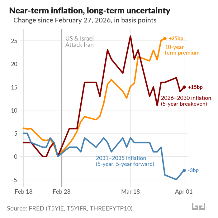
Since February 27, the five-year breakeven has risen 15 basis points (hundredths of a percentage point) to 2.55%. The market expects somewhat higher inflation over the next five years, which makes sense given an oil price that nearly doubled. But the five-year, five-year forward rate — a measure of expected inflation in years five through ten — actually fell 3 basis points to 2.07%.
In short: near-term inflation expectations rise; long-term expectations stay anchored. Oil futures tell the same story. The August WTI contract is trading around $79, well below the $105 spot price, meaning the market expects the disruption to fade. That said, the IEA has noted that more than 40 energy sites across nine countries have sustained severe damage, which could extend the disruption beyond what futures currently price.
The cost shows up in the term premium
If markets view the inflation shock as temporary, why have longer-term yields risen? The 10-year Treasury yield is up 33 basis points since February 27. Almost all of that increase, 28 basis points, comes from higher real yields. Inflation expectations barely moved.
The explanation lies in the term premium. When investors buy a 10-year bond, they are locking up their money for a decade. The term premium is the extra compensation they demand for taking on that uncertainty: the risk that the economy, inflation, or policy could go in unexpected directions. The Federal Reserve publishes an estimate using a model called Kim-Wright.
Since the war began, the Kim-Wright 10-year term premium has risen 25 basis points. That accounts for most of the rise in the 10-year yield. Investors are pricing in a more uncertain world. Oil supply disruptions and geopolitical conflict make long-term bonds riskier to hold.
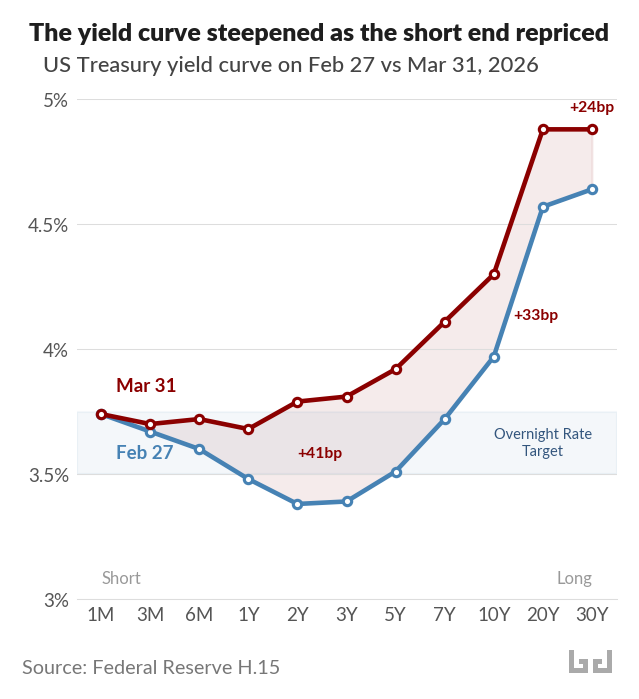
The yield curve steepened
The yield curve plots Treasury yields from the shortest maturities to the longest. Since February 27, it shifted upward across the board, but not evenly. The two-year yield jumped 41 basis points, exceeding the Fed’s overnight rate target of 3.50-3.75%. The 10-year rose 33. The 30-year rose 24.
The short end of the curve reflects expectations about what the Fed will do in the near term. When the two-year yield rises above the overnight rate, it means markets expect the Fed to hold rates where they are. Before the oil shock, core PCE inflation — which strips out food and energy — had already climbed to 3.1% in January, stalling the disinflationary trend from 2023–2024. The oil shock eliminated any remaining room the Fed had to cut.
The real rate dip
The Fed is holding rates steady, but monetary conditions are loosening anyway. As headline inflation rises from the oil shock, the real fed funds rate — the policy rate minus inflation — falls without the Fed doing anything. It has already dropped from about 1.0% in February to 0.4% in March. The OECD forecasts US inflation reaching 4.2% this year; if that materializes with the overnight rate unchanged, the real rate would be roughly -0.5%.
This automatic loosening provides a modest cushion on the demand side during the supply shock. But it only works if the Fed holds steady. Raising rates to chase headline inflation would eliminate the cushion and tighten into a supply disruption. This is a shock that monetary policy cannot fix. The supply problem can only be resolved by reopening the Strait of Hormuz or reducing dependence on oil that passes through it.
]]>The Hiring Freeze and Who It Traps2026-03-26T04:06:38+00:002026-03-26T04:06:38+00:00https://bd-econ.com/blog/2026/03/26/the-hiring-freeze-and-who-it-trapsThe unemployment rate has risen to 4.4% — still low by historical standards, but up from 3.4% two years ago. Underneath that number, hiring has stalled, job searches are lasting longer, and a growing number of people have stopped looking altogether. This is what a hiring freeze looks like — and it is a different kind of problem than the recessions our policy tools were built for.
Hiring, quitting, and job-switching have all slowed
Employee turnover hit a nine-year low in January 2026, and the pay bump workers get for switching jobs is at its lowest since 2017. Workers are behaving accordingly: the NY Fed’s Survey of Consumer Expectations shows the share of employed people who expect to voluntarily leave their job fell to 15.9% in February — the lowest in the survey’s history.
The most affected group is people looking for their first job. Unemployment among college graduates aged 22-27 has risen to 5.6%, sharply above the overall rate, with over 40% in jobs outside their field. The Cleveland Fed found that the rate at which unemployed graduates find work has fallen from 47% to 37% since 2000, and that high school graduates now exit unemployment faster than college graduates — a reversal of the historical pattern.
A different kind of deterioration
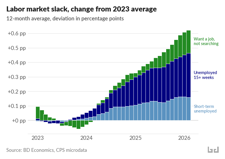
The Sahm rule, a widely watched recession signal based on rising unemployment, triggered in mid-2024 and has since receded. A slow rise in unemployment captures only part of what is happening. The number of people unemployed 15 weeks or longer has risen 45% since 2023. Another 6 million people want a job but have stopped actively searching — a population entirely outside the unemployment rate.
Using the Current Population Survey, I counted everyone who wants work — whether they are actively searching (and counted as unemployed) or have given up searching (and are not counted). As a share of the population, this group has grown steadily since 2023, and totals about 13 million people over the last 12 months of data.
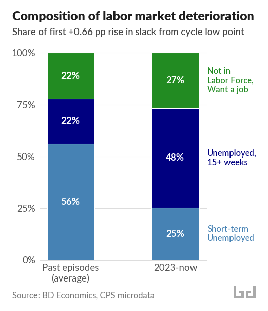
What makes this episode different is where the increase is coming from. In the dot-com recession, the Great Recession, and COVID, the increase was driven mainly by a wave of people losing jobs — newly unemployed workers who had been searching for less than 15 weeks. In the current episode, that group accounts for just 25% of the increase. Nearly half comes from people who have been unemployed 15 weeks or longer, and over a quarter from people who have stopped searching entirely.
Duration is a trap
Employers treat nine months without work as equivalent to four years of lost experience. Skills atrophy. Job searchers lose motivation. A Minneapolis Fed analysis found that long-term unemployment has trended upward for decades, and that workers who start looking for work during downturns experience earnings losses that persist for years.
This pattern — where time out of work makes it harder to find work — is well-documented among the unemployed. Survey data shows it operates among people outside the labor force too: the longer someone has been wanting work without finding it, the lower their already dismal chances of getting back in — and those chances have been falling.1 This is a population of millions that the unemployment rate does not track.
The labor market entered 2026 with less cushion than it had in 2022. The surplus of job openings that supported the labor market in 2022-2023 has closed, and the pandemic-era savings buffer has been depleted. If hiring remains frozen, people stuck in long job searches and people who have stopped searching have fewer paths back in than they would have had two years ago.
Policy for a freeze, not a crash
Unemployment insurance was designed in 1935 for temporary layoffs: lose a job, collect benefits, get rehired when demand recovers. That system was built for a different problem. Only about a third of unemployed workers receive unemployment benefits. Young people looking for their first job qualify for nothing at all.
Meanwhile, about 6 to 7 million people per year lose work and want a new job, but never show up in the unemployment statistics because they are not actively searching. Most are part-time or self-employed workers who face severe eligibility barriers. The safety net largely misses them.
Beyond reforming unemployment insurance, some countries invest directly in helping people find new work — through job placement services, retraining, and training programs tied to specific industries. The US spends 0.1% of GDP on these active labor market programs. Denmark spends 2%, and sees substantially higher rates of people finding new work. Similar programs included in US trade adjustment assistance resulted in persistent earnings gains for workers who participated.